Visualizations
This section outlines the process of creating specific visualizations for reports or views within Brinqa applications. When creating visualizations a data model will be selected, along with measures and dimensions, which determine the contents of the visualization.
For general information on visualizations, see the visualization section of the Reports article.
Table
To display a table of values, select the Table visualization. Columns are determined by both your dimensions and measures. Rows on the table will be sets of data according to those dimensions.
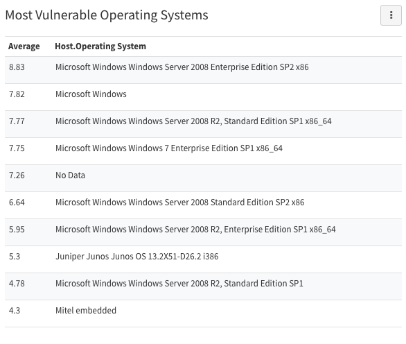
Create a table of the most vulnerable operating systems
- Create a report and click Add Section
- Select Table
- Enter a title for the section like “Most Vulnerable Operating Systems”
- Choose the Vulnerability data model
- Click the Measures field
- Choose Average as the function and CVSS Base Score as the attribute. This means the set of data to be sorted by our dimensions will be the average CVSS base score of vulnerabilities.
- Click the Dimensions field
- Scroll to the bottom of the attribute list and click “Show related attributes…”. This will allow us to select attributes from a related data model. In this case, we want access to the OS attribute of the host.
- Click Host -> Host Attributes then select .Operating System. Now our average CVSS score data will be sorted by what host operating system the associated vulnerabilities were found on.
- Set the Limit field to how many rows of data you want to display. In this case, each row will correspond with a single operating system.
- Click the Sort by field
- Select Average as the attribute and Descending as the direction.
- Click Add
Optional: Change average number formatting
You can also change the appearance of visualizations in a variety of ways. In this case, the average CVSS base score of some OSs may display more decimal places than you need. To change the decimals displayed:
- Click the Edit button associated with the section
- Select Display
- Navigate to the Columns tab
- Click the Rendering field associated with Average and select Number
- Click the Paintbrush button next to the rendering option
- Enter the number of decimal places you want displayed
- Click Update
Single Value
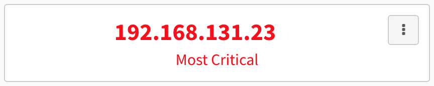
To display a single value, select the Single Value visualization. This will display a single value from the selected data model. These visualizations are often used to display a count (e.g. total number of critical vulnerabilities in the system), but can also be used to display information like the most critical host IP.
When creating a single value visualization for something like most critical host IP, you’re telling the application to display the top field from a table you’ve created and ordered. The directions below cover how to create one of this type of single value visualizations.
Create a single value displaying the IP of the most critical host on the network
- Create a report and click Add Section
- Select Single Value
- Enter a title for the section like “Most Critical IP”
- Choose the Vulnerability data model
- Click the Measures field
- Choose Count as the function. This will provide us with a count of all vulnerabilities.
- Click the Dimensions field
- Choose Host. Now the vulnerability count will be sorted by what host the vulnerabilities appear on.
- Click the Sort by field
- Select Count as the attribute and Descending as the direction. This orders the hosts by which have the highest number of vulnerabilities. Again, we’re creating a table of information from which this visualization will only display the top entry.
- Click Add
- Click the Edit button associated with the section
- Select Filters
- Create the following condition: Risk Rating Equals to Critical. This will tell the system to give us not just the host with the most vulnerabilities of any kind, but the host with the most critical vulnerabilities.
- Click Update
- Click the Edit button associated with the section
- Select Display
- In the Value field on the General tab, select Host. This tells the visualization that, of the two fields in the top row, you want to to display the host name rather than the vulnerability count.
- Click Update
Optional: Change the display color of the value
You may want to use color to highlight important items on your reports. In this case, you could change the single value visualization to display in red. To change the color of the visualization:
- Click the Edit button associated with the section
- Select Display
- Navigate to the Appearance tab
- Enter “red” in the Section color Text field
- Click Update
Angular Gauge
To display a value on a gauge, select the Angular Gauge visualization. This will display a single value from the selected data model as a ratio. For example, a risk rating gauge might display a risk rating of 6.5 and show the gauge "filled" roughly two-thirds, since risk rating is a number out of 10.
Create an agular gauge displaying the top host risk score
- Create a report and click Add Section
- Select Angular Gauge
- Enter a title for the section like “Top Host Risk Score”
- Choose the Host data model
- Click the Measures field
- Choose Max as the function and Risk Score as the attribute
- Click Add
- Click the Edit button associated with the section
- Select Display
- Enter 10 in the Range Max field. This will show the ratio of the value to its maximum on the dial of the gauge.
- Click Add
Optional: Give the gauge conditional coloring
You may want to use color to highlight whether a value is within an acceptable range or not. This will set the gauge to have conditional colors based on whether the risk score is high, medium, or low.
- Click the Edit button associated with the section
- Select Display
- Navigate to the Appearance tab
- Check Conditional Colors under Options
- Use the + button to add two rows, so that there are three conditional color setting rows total
- Enter ranges for each row (e.g. 0 to 3, 3.001 to 6, and 6.001 to 10). These will determine what gauge values will result in particular colors.
- Enter color names for each range in the Color field (e.g. yellow, orange, and red). These will determine what colors appear for gauge values in that range.
- Click Update

Line
To display a line graph of values, select the Line visualization. Line graphs are useful for displaying data that changes over time. When building a line graph, dimensions will determine the X-axis, and measures will populate the Y-axis. If you’ve chosen a line graph visualization, at least one of your dimensions should be time-related.
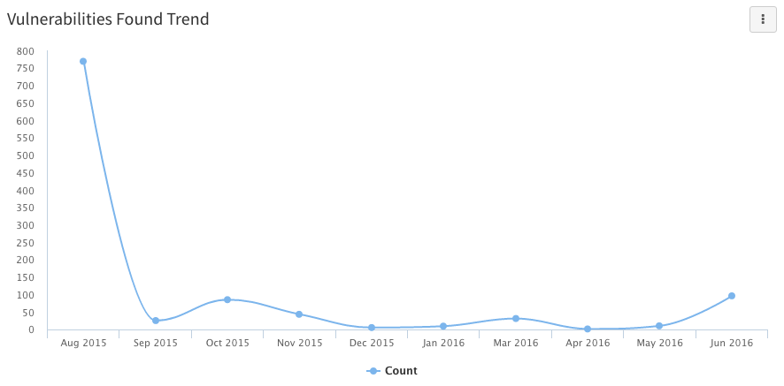
Create a line chart showing new vulnerabilities each month
- Create a report and click Add Section
- Select Line
- Enter a title for the section like “Vulnerabilities Found Trend”
- Choose the Vulnerability data model
- Click the Measures field
- Choose Count as the function. This will provide us with a count of all vulnerabilities.
- Click the Dimensions field
- Choose First Found. The first found field is a timestamp, so you can select which part of the timestamp is relevant for the graph using the Transformation field. Selecting Month for that field will show the number of vulnerabilities by month in which they were first found.
- Click the Sort by field
- Select First Found as the attribute and Ascending as the direction. This orders the months along the x-axis chronologically from left to right.
- Click Add
Optional: Make the line smooth
- Click the Edit button associated with the section
- Select Display
- Select Smooth Line under Options on the General tab. This makes the graph line less angular.
- Click Update
Area
To display an area graph of values, select the Area visualization. Area graphs will have the area between the line and the X-axis shaded in. When building an area graph, dimensions will determine the X-axis and measures will populate the Y-axis. If you’ve chosen an area graph visualization, at least one of your dimensions should be time-related.
Area graphs can be used any time you would use a line graph. They are especially useful when you're tracking multiple lines of data simultaneously, since the shading helps visually differentiate the elements being tracked.
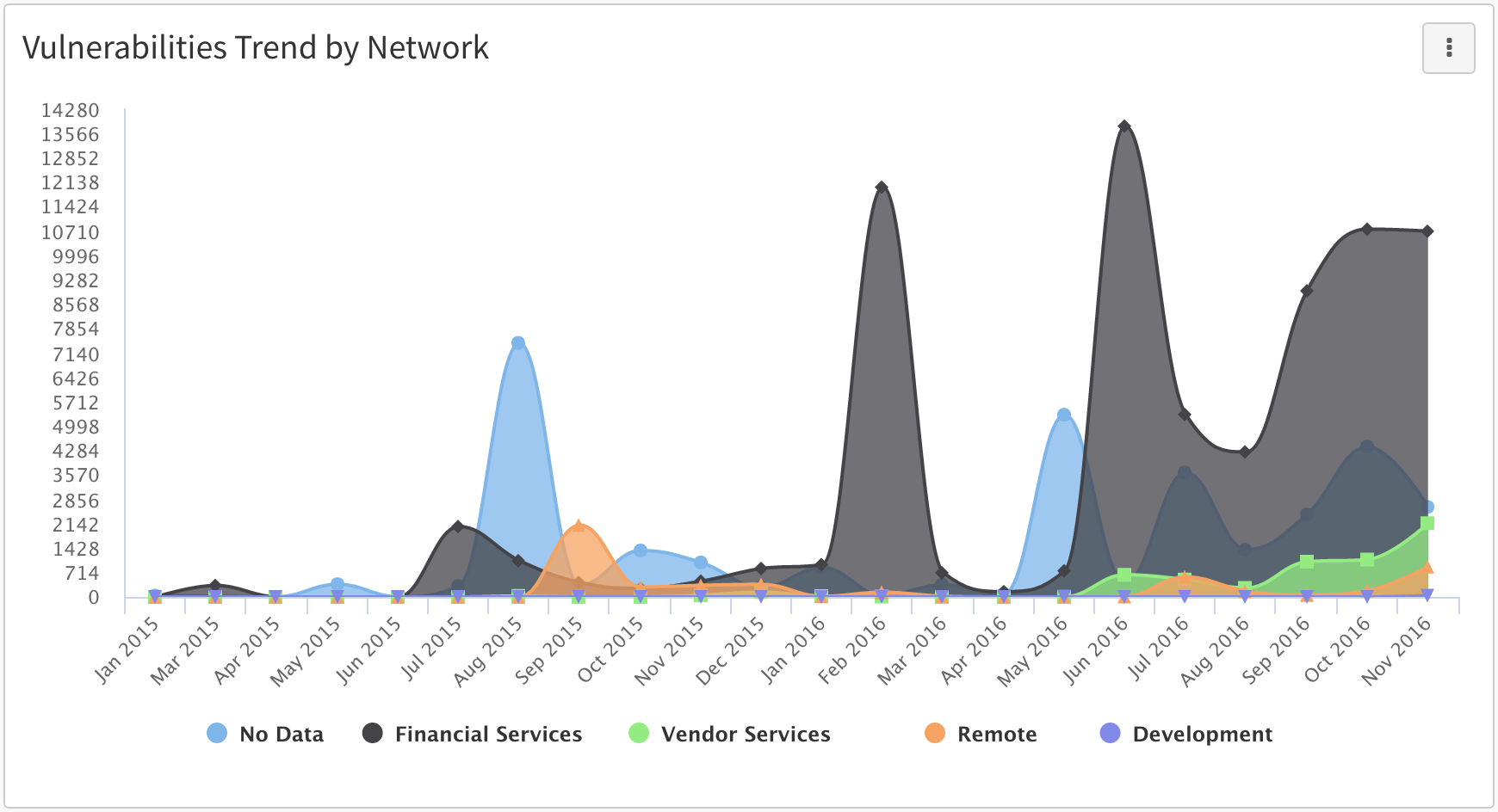
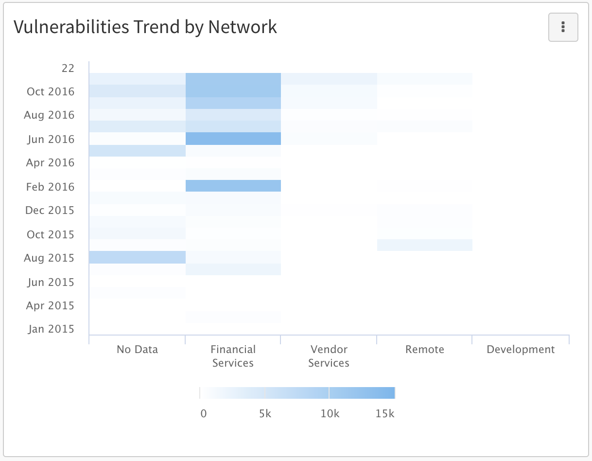
Create a trend graph showing vulnerability trends by network
- Create a report and click Add Section
- Select Area
- Enter a title for the section like “Vulnerabilities Trend by Network”
- Choose the Vulnerability data model
- Click the Measures field
- Choose Count as the function. This will provide us with a count of all vulnerabilities.
- Click the Dimensions field
- Choose First Found. The first found field is a timestamp, so you can select which part of the timestamp is relevant for the graph using the Transformation field. Selecting Month for that field will show the number of vulnerabilities by month in which they were first found.
- Click the Dimensions field
- Scroll to the bottom of the attribute list and click “Show related attributes…”. This will allow us to select attributes from a related data model. In this case, we want access to the Network attribute of the host.
- Click Host -> Host Attributes then select .Network. Now our total vulnerability data will be sorted both by what month it was found in and which network it was found on.
- Click the Sort by field
- Select First Found as the attribute and Ascending as the direction. This orders the months along the x-axis chronologically from left to right.
- Click Add
Optional: Set the colors for each network line
- Click the Edit button associated with the section
- Select Display
- Navigate to the Colors tab
- Select Conditional and add one condition for each network
- In the Value fields enter network names
- In the Color fields enter color names or hex codes
- Click Update
Column
To display columns of data, select the Column visualization. When building a column graph, dimensions will determine the X-axis, and measures will determine what populates the Y-axis.
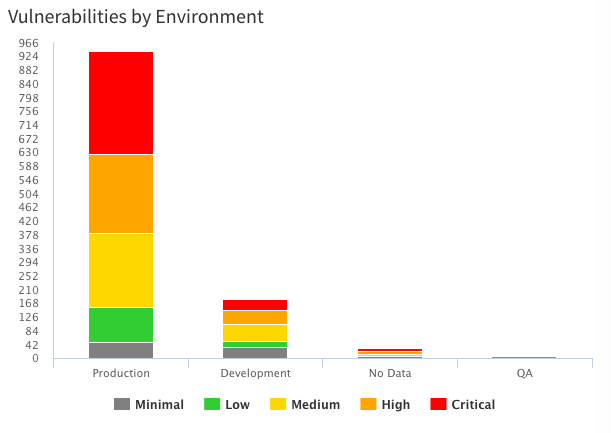
Create a column graph showing vulnerabilities by environment and risk rating
- Create a report and click Add Section
- Select Column
- Enter a title for the section like “Vulnerabilities by Environment”
- Choose the Vulnerability data model
- Click the Measures field
- Choose Count as the function. This will provide us with a count of all vulnerabilities.
- Click the Dimensions field
- Scroll to the bottom of the attribute list and click “Show related attributes…”. This will allow us to select attributes from a related data model. In this case, we want access to the Environment attribute of the host.
- Click Host -> Host Attributes then select .Environment. Now our vulnerabilities will be sorted by what host environment they were found on.
- Click the Dimensions field again
- Select Risk Rating. Now our vulnerabilities will be sorted both by risk rating and what host environment they were found on.
- Click Add
Optional: Stack and color-code risk rating data
If you want to display one vulnerability total for each environment, but want that total column to be visually divided by the risk rating of the vulnerabilities, you can use the stack option. This takes the separate risk rating columns displayed after following the above directions and “stacks” them. You can then color code each section of the stack according to risk rating to make it easier to identify which portion of the stack is highest risk.
- Click the Edit button associated with the section
- Select Display
- Select Normal under Stacking on the General tab. This will “stack” the separate columns of vulnerabilities.
- Navigate to the Appearance tab
- Select Conditional and add one condition for each risk rating
- In the Value fields enter risk rating names (e.g. Critical, High, Medium)
- In the Color fields enter color names or hex codes
- Click Update
Bar
To display bars of data, select the Bar visualization. When building a bar graph, dimensions will determine the X-axis and measures will determine what populates the Y-axis. Bar graphs can be used any time you would use a column graph.
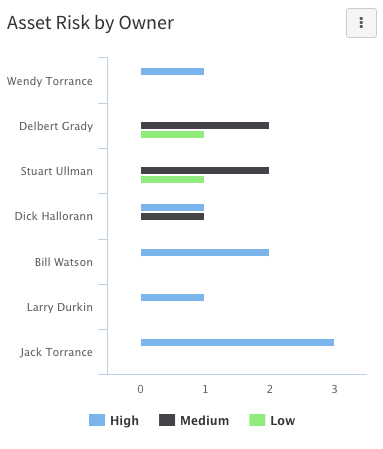
Create a bar graph showing asset risk by owner
- Create a report and click Add Section
- Select Bar
- Enter a title for the section like “Asset Risk by Owner”
- Choose the Host data model
- Click the Measures field
- Choose Count as the function. This will provide us with a count of all hosts.
- Click the Dimensions field
- Select Risk Rating. Now our hosts will be sorted according to their risk rating.
- Click the Dimensions field again
- Select Owner. Now our hosts will be sorted both by risk rating and who owns the host.
- Click Add
- Click the Edit button and select Filters.
- Create the following condition: Risk Rating Not equals to Minimal. This will tell the system to ignore hosts that have “minimal” as their risk rating, since higher risk ratings will be more important to identify.
- Click Update
Pie
To display a pie chart of values, select the Pie visualization. Pie charts are useful for displaying proportional information, like what percent of all tickets are critical priority.
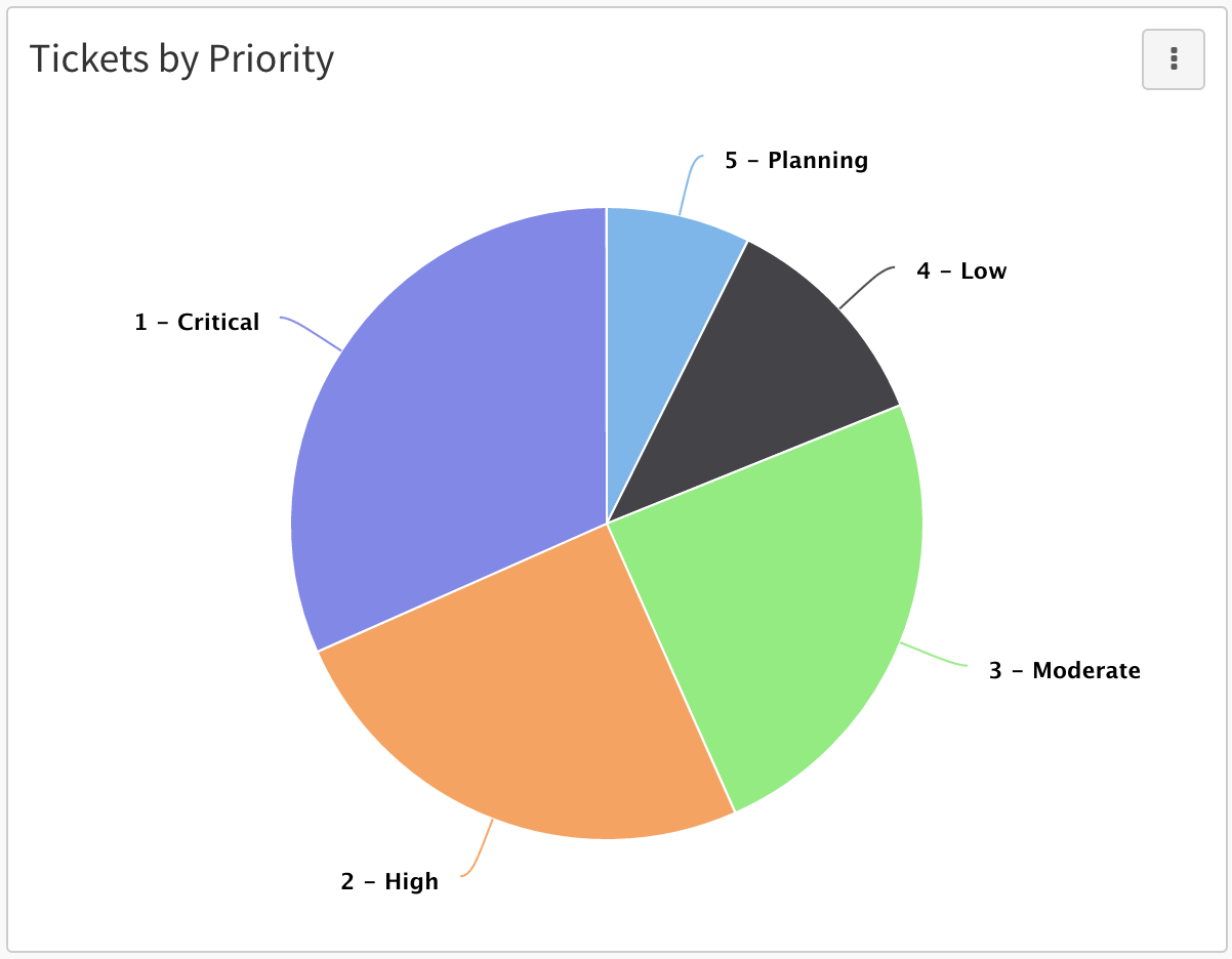
Create a pie chart showing tickets by priority
- Create a report and click Add Section
- Select Pie
- Enter a title for the section like “Tickets by Priority”
- Choose the Ticket data model
- Click the Measures field
- Choose Count as the function. This will provide us with a count of all tickets.
- Click the Dimensions field
- Select Priority. Now our tickets will be sorted by their priority rating.
- Click the Sort by field
- Select Priority as the attribute and Descending as the direction.
- Click Add
Optional: Change the colors of the slices
- Click the Edit button associated with the section
- Select Display
- Navigate to the Appearance tab
- Select Conditional and add one condition for each priority
- In the Value fields enter priority names (e.g. Critical, High, Moderate)
- In the Color fields enter color names or hex codes
- Click Update
Donut
To display a donut chart of values, select the Donut visualization. Donut charts are useful for displaying proportional information, like what percent of all tickets are assigned to each user. Donut charts can be used interchangeably with pie charts.
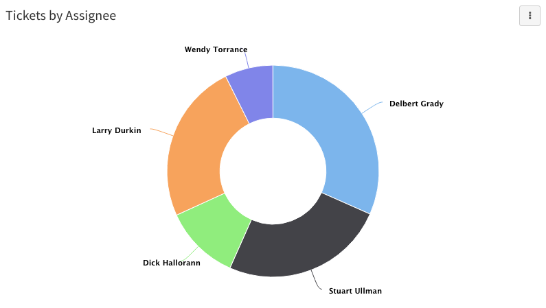
Create a donut chart showing tickets by assignee
- Create a report and click Add Section
- Select Donut
- Enter a title for the section like “Tickets by Assignee”
- Choose the Ticket data model
- Click the Measures field
- Choose Count as the function. This will provide us with a count of all tickets.
- Click the Dimensions field
- Select Assigned to. Now our tickets will be sorted by who they are assigned to.
- Click Add
Optional: Change the colors of the slices
- Click the Edit button associated with the section
- Select Display
- Navigate to the Appearance tab
- Select Conditional and add one condition for each potential ticket assignee
- In the Value fields enter user names
- In the Color fields enter color names or hex codes
- Click Update
Heatmap
To display a heatmap of values, select the Heatmap visualization. Heatmaps are useful for showing where issues are concentrated. Higher concentration areas will display in darker colors and lower concentration areas will display in lighter colors.
Create a heatmap showing vulnerability trends by network
- Create a report and click Add Section and select Heatmap
- Enter a title for the section like “Vulnerability Trend by Network”
- Choose the Vulnerability data model
- Click the Measures field
- Choose Count as the function. This will provide us with a count of all vulnerabilities.
- Click the Dimensions field
- Select First Found. The first found field is a timestamp, so you can select which part of the timestamp is relevant for the heatmap using the Transformation field. Selecting Month for that field will show the number of vulnerabilities by month in which they were first found.
- Click the Dimensions field again
- Scroll to the bottom of the attribute list and click “Show related attributes…”. This will allow us to select attributes from a related data model. In this case, we want access to the network attribute of the host.
- Click Host -> Host Attributes then select .Network. Now our vulnerability count will be sorted by both what when they were first found and what network they were found on.
- Click the Sort by field
- Select First Found as the attribute and Ascending or Descending as the direction.
- Click Add
- Click the Edit button associated with the section
- Select Display
- Navigate to the Axes tab
- Click the Value field in the vertical axis section and select First Found
- Click the Value field in the horizontal axis section and select Host.Network
- Click the Group by field and select Count
- Click Update
Optional: Change the heatmap color
- Click the Edit button associated with the section
- Select Display
- Navigate to the Appearance tab
- In the Default colors field, enter a color name or hex code.
- Click Update
Treemap
To display a treemap of values, select the Treemap visualization. Treemaps display hierarchical data as nested rectangles. Treemaps are useful for displaying proportional information like percentages.
Create a treemap of vulnerabilities by host and severity
- Create a report and click Add Section and select Treemap
- Enter a title for the section like “Vulnerabilities by Host”
- Choose the Vulnerability data model
- Click the Measures field
- Choose Count as the function. This will provide us with a count of all vulnerabilities.
- Click the Dimensions field
- Scroll to the bottom of the attribute list and click “Show related attributes…”. This will allow us to select attributes from a related data model. In this case, we want access to the network attribute of the host.
- Click Host -> Host Attributes then select .Network. Now our vulnerability count will be sorted by both what when they were first found and what network they were found on
- Click the Dimensions field again
- Select Severity
- Click Add
- Click the Edit button associated with the section
- Select Display
- Navigate to the Axes tab
- Click the Value field in the vertical axis section and select Host.Network
- Click the Value field in the horizontal axis section and select Count
- Click the Group by field and select Severity
- Click Update
HTML
To display a section of rich text created with HTML, select the HTML visualization. HTML sections will display text that can be formatted with a subset of html tags. They are useful for adding formatted blocks of text to reports.
Create an HTML section explaining another visualization
- Create a report and click Add Section and select HTML
- Select nothing on the Edit Section modal and click Add. This will create an HTML section that displays rich text only and no data.
- Click the Edit button associated with the section
- Select Display
- Enter text and HTML into the HTML field on the Content tab
- Click Update
The example below uses the following HTML:


Trend
To display a trend chart showing historical values of attributes, select the Trend visualization. Trend charts will display things like the count of certain values over time. They are useful for seeing historical trends in data.
Trend charts can only reference attributes that have been historically tracked.
Create a trend chart showing reopened tickets per week
- Create a report and click Add Section and select Trend
- Choose the Ticket data model
- Click the Measures field
- Choose Count as the function. This will provide us with a count of all tickets.
- Click the Attributes field
- Select Status as the attribute. This will show ticket counts divided by their status.
- Click the Historical date field
- Select Week. This will show the ticket counts per status by week.
- Click the Sort by field
- Select Ascending. This will sort the dates in order from latest to most recent.
- Click Add
- Click the Edit button associated with the section
- Select Filters
- Create the following condition: Status Equals to Reopened. This will tell the system to show only the trend line for re-opened tickets.
- Click Update
